What's your name again? A decade of Workshop Nametags
The nametag has been a feature (collector's item?) since the 2013 EdTech Workshop (ETWS). Known for it's size, design, and handiness, the nametag has become a record of how the Workshop has evolved over the past 10 years. Let's review its origins and how it has changed!
The 4x6" nametag is one of the printed design assets that we use to visually communicate all the goals for the Workshop (if you're hosting an event, you might consider using the U of T Lanyard lending program). The EdTech Workshop is designed for educators and staff interested in educational technology. Since its inception, this free, full-day workshop features different types of sessions (the theme varyies by year) including case studies, interactive workshops, hands on sessions, and demonstrations of (established and new) technologies for use in teaching. The day aims to provide you with a better understanding of how to use technology effectively in the classroom to enhance the learning experience of your students. It's also a challenge and an opportunity to use the day as a model; how can visual design enhance engagement? Can we model how to embed technology into in person classes? This hasn't changed over time; we aim to make the day practical, informative, and fun.
Goals for the Nametags
- Legible from a distance. I wanted the nametags to be easy to read, informal (focusing on given versus family names, not including roles and positions, featuring interests and conversation starters, etc.). In my experience, attendings conferences with the goal of networking was overwhelming for an introvert - and I wanted to avoid the entire fear of "what is their name again?" or "do they remember my name?"
- Include a "cheat sheet" schedule. From the beginning, I also wanted to include a schedule on the nametag. I always found myself flipping through long programs or trying to look up digital schedules on an unresponsive website on my phone (which again, was a lot less powerful in 2013). I wanted to be able to see an outline of the event, with only key titles and locations - a very quick reference that would allow me to change my mind without too much head ache. This led to really big name tags! While 4x6 nametags have become more common in the years since, the number one reaction to these in 2013 was, "whoa, that's a big nametag!"
- Personalized with an interest or other conversation starter. Meeting new people (even when its your goal) can be nervewracking at conferences. But, by providing something "more" about you in the form of a personlized interest, we hoped that we'd be building in conversation starters right into your nametag. It's a lot less intimidating to say, "Oh, I'm also interested in assessments!" than to start out with a cold open.
- Beautifully designed. Digital assets are critical in communicating the vibe of the event. Each year, we brainstorm what that is - some years are more serious than others. In 2023, we very quickly moved in on creating an in person that doesn't take itself very seriously. Motivated to chase joy, we've designed a program and activities that remind us that we belong to an amazing teaching and learning community at the University of Toronto.
EdTech Workshop 2013 Nametag
Designer: Allison Van Beek
Key Elements:
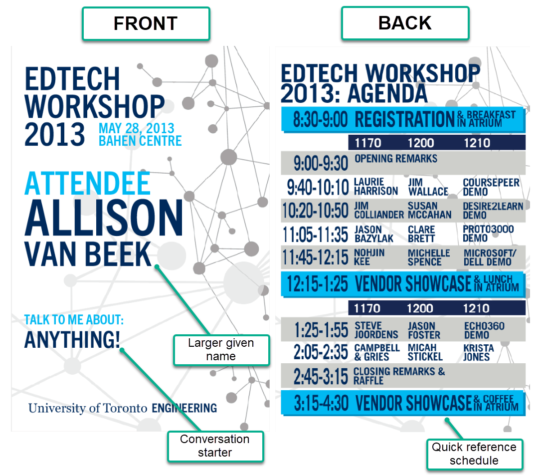
- Given name is larger than the family name. We try to foster a more informal environment at the EdTech Workshop and this is one way to do this.
- Conversation starter. On the registration form, we asked attendees about something they were interested in.
- Quick reference schedule. A stalwart of ETWS nametag design is the "quick flip" schedule. It's a truncated version of the full schedule but useful to orient and reference at-a-glance.
EdTech Workshop 2015 Nametag
Designer: Allison Van Beek
Key Elements:
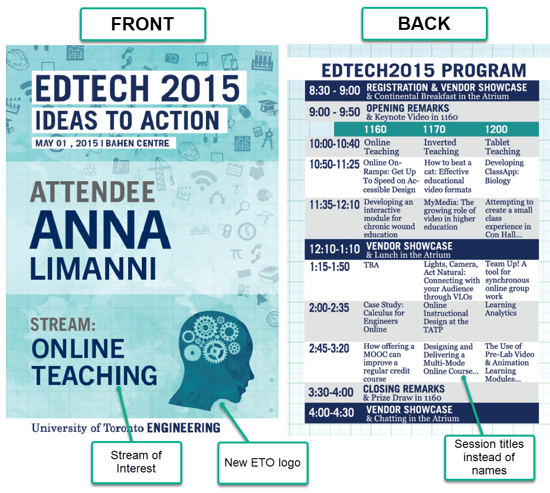
- Stream of Interest. In 2015, we introduced the idea of session streams, where you could self-select into a stream and attend sessions on that topic for the whole day. Identifying the stream on the nametage enabled you to connect with others also interested in that topic.
- Introduced the new Education Technology Office (ETO) logo. Over the years, the ETO has grown; one way to reflect this growth was some visual branding to start to define the nature and attitude of the office.
- Session Titles instead of names. Based on attendee feedback, we swapped identifying the sessions by name to title. This communicated the session topics more clearly and removed the need to know the "who" behind the "what."
EdTech Workshop 2017 Nametag
Designer: Joanna Lau
Key Elements:
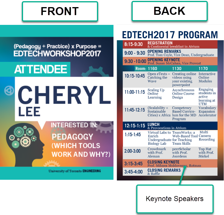
- Added Keynote Sessions. Not a tonne of design changes between 2015 and 2017, but the program for the event changed in a major way as we added opening and closing sessions. These sessions were "all attendees" sessions and serve (still) to set the tone for the day.
EdTech Workshop 2019 Nametag
Designer: Joanna Lau
Key Elements:
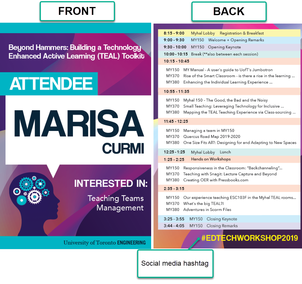
- Added social media hashtag. With middling success, we tried to foster online interaction through a social media hashtag (which is pretty standard across events and conferences). We've kept this each year, but there's still room for improvement for this to be truly impactful.
EdTech Workshop 2021 Nametag
In 2021, we hosted a virtual EdTech Workshop, so no nametags for this year. We did produce a series of virtual backgrounds instead.
EdTech Workshop 2023 Nametag
Designer: Cheryl Lee
Key Elements:
- New event branding. With the growth of the ETO team, we now have a full time graphic and media developer (Cheryl Lee). We were able to dedicate her time to this event to maxmize visual design pre, during, and post event.
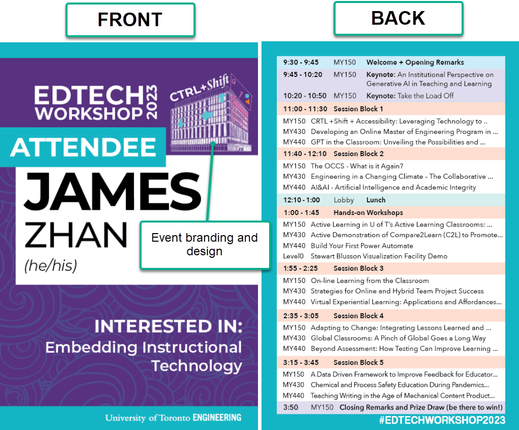
And that's it! The EdTech Workshop 2023: CTRL +shift was our most recent event (hosted on May 17, 2023). If you have any questions about the Workshop, or about the work of the ETO, please email us using fase.edtech@utoronto.ca. We hope to see you in 2025!
