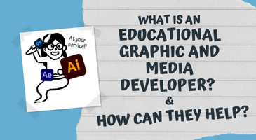
Designing visual elements that pop (and promote learning)!
Learn about how the ETO's Educational Graphic and Media Developer can help elevate your content via our review and design process (and see an example with...eggs)!
 A picture is worth a thousand words; you might have had this old adage pop into your head when you read about the importance of visuals in your online content. Perhaps you thought, “Okay, I understand that visuals can help the viewer retain information for longer, and make communication quicker and simpler, great! I’m going to look for some images to help me out.”
Only to have spend hours searching for the right picture… and you just can’t find one (so many are imperfect or aren’t licensed for open or educational use), and you were left thinking, “… I don’t have time for this… should I just draw it myself?” Even if you have the skills to do this, you might not have the time to do it. Worse, the last thing you want to do is spend time on something that negatively impacts learning by making something less clear or more confusing.
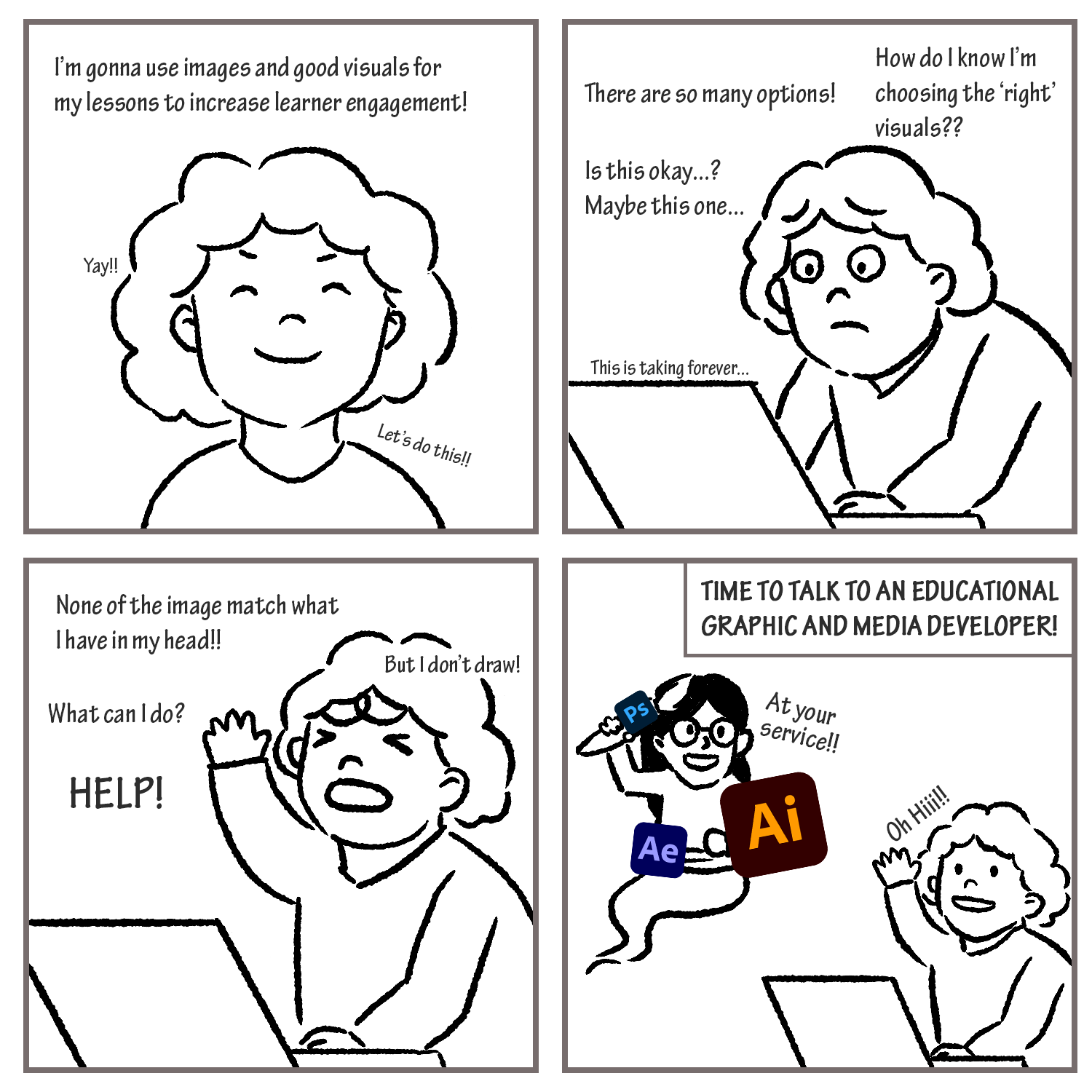
ALT TEXT: The above 2x2 grid comic shows a simple handdrawn, frustrated instructor, unsure of how to create or find strong visual content. After expressing frustration through textual “thoughts” on the squares, the Educational Graphic and Media Developer arrives (in the form of a magical helpful genie) to help the instructor.
Who can you turn to for questions like this? An educational graphic and media developer! That’s right, the FASE EdTech Office has a new member of the team (meet the newest member of the ETO team: Cheryl Heeyeon Lee) and she’s well positioned to help you assess and elevate your images, diagrams and figures.
What does an Educational Graphic and Media Developer do?
An Educational Graphic and Media Developer is a graphic designer who specializes in creating learning objects (figures, illustrations, animations, games, etc). They work together with subject matter experts and instructional designers to assess the current visuals used in your presentation and/or lessons and provide feedback for improvement based on Principles of Multimedia Learning.
Here are some examples of what the Educational Graphic and Media Developer can do:
- Create an illustration/animation that reinforces a key point in the lesson
- Search through the visual database for you, and provide you with a high-quality image for usage in lessons
- Stylize your presentation deck, provide you with set of icons that could serve as visual reminders for the learners throughout the course
- Give recommendations on what type of animation/slide transition to use (or not)
- Assess with instructional designer if another medium (e.g. illustration vs. animation) would be more effective to optimize the learning potentials, and create them
- Facilitate the development of new visual communication tools for the purpose of education by collaborating with the Subject Matter Expert (the Instructor) and Instructional Designer
Can I see an visual example?
Phase 01: Review Original Content
When we started looking at this original slide (below) which uses a visual analogy of egg to a geological deposit, it had a feeling of crowding and a lack of hierarchy.
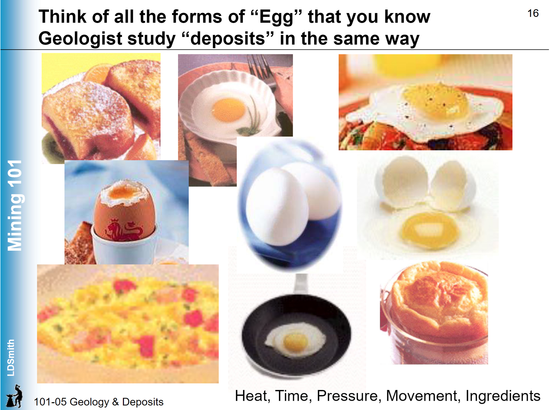
On the slide image above, the instructor is using ‘eggs’ to depict how they have different forms depending on variables (heat, time, pressure, movement, and other ingredients) introduced to it – raw eggs, sunny-side ups, deep fried, hard boiled, scrambled, French toast, quiche, Yorkshire puddings. This analogy is then extended to deposits, which are studied the same way by a geologist.
However, the analogy may be difficult to discern if you weren’t already familiar with the instructional material, and if you randomly just came across this slide by chance. So how can we make this slide, which is already ‘visual’ even more meaningful and memorable?
Phase 02: Focus on lay out and content
Let’s review some suggestions we made to the instructor (we make suggestions, you make decisions about your content) about the slide’s organization and lay out:
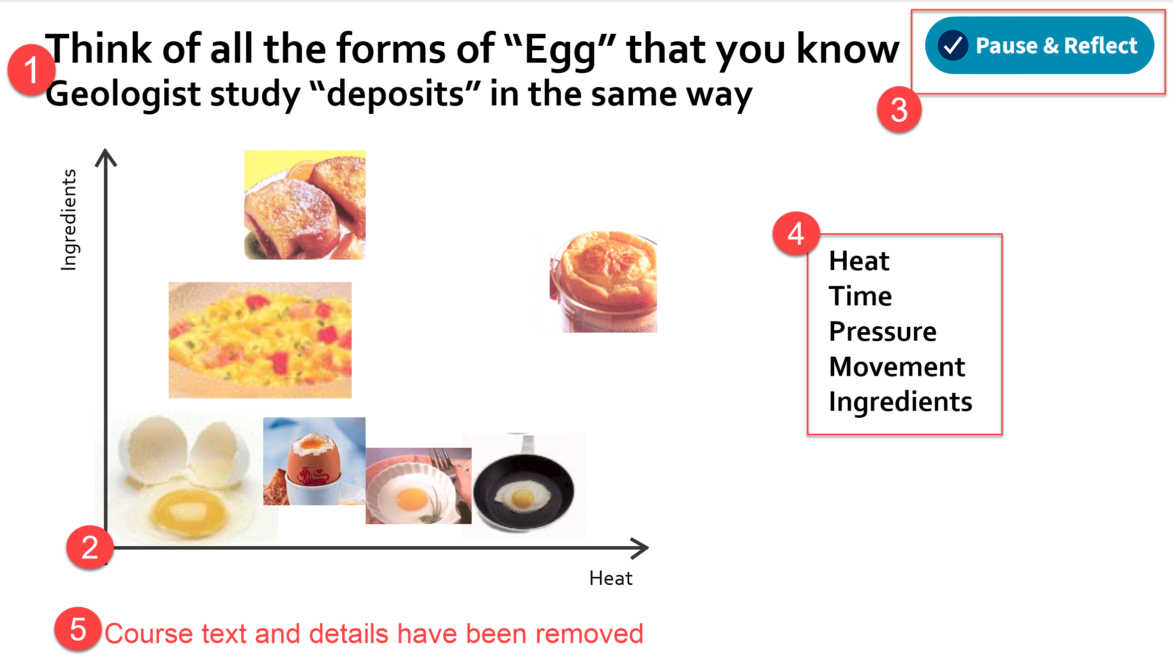
Summary of lay out and content suggestions:
- Use font size hierarchy to suggest the order of processing (start with asking yourself a question and then transfer it to what you know about geology)
- Add an axis to provide structure and context to the ordering and lay out of the images
- Add an icon (e.g. Pause & Reflect!) to demonstrate to students that this is a reflection activity; when used consistently throughout a project, this can help students develop a routine
- Add a list of key attributes (heat, time, etc); these would be ideally dynamic, appearing as the voice over mentions them, implementing “see and say”
- Removed class/date/course specific information to promote re-used across terms; we try to ensure that your content is evergreen and lasts you a very long time
Phase 03: Polish with illustration and design
Once we have the lay out finalized, we really add the uniqueness. For brownie points, we can then turn this into a simple illustration, provide visual consistency across to lessen the cognitive load (used for visual processing) for the learner, providing more capacity for listening or reading instead! Let’s review some suggestions we made to the instructor (we make suggestions, you make decisions about your content) about the illustration and design.
Summary of illustration and design suggestions:
- Make the image style consistent; by illustrating the images, we have made them cohesive and reduced the clutter of different styles and qualities of clip art
- Created a project style that can be used across course materials
- Developed a figure that can be used however the instructor would like; open access and no copyright violations
- Added labels tightly tied geographically to the image they represent
And here is what it looks like:
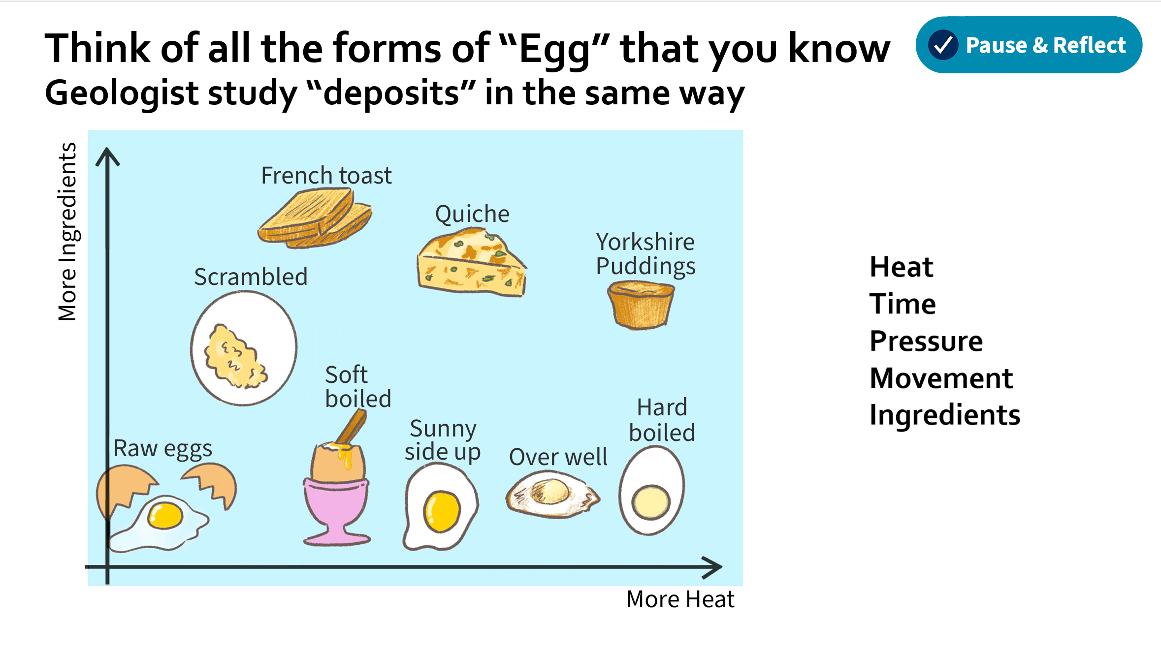
The above example illustration could be treated in multiple ways. It could be part of a video (likely with some dynamic elements) or be used as a stand-alone diagram. To decide, you can think about how you'd typically teach this content and how to offer it in multiple formats to promote the universal design of learning. Whatever you choose, when shown in its completion, the goal is to show the meaning of the slide clearly without requiring too much explanation. How do you know if you've accomplished this? Ask yourself, if a learner wanted to take note of this, and they took a screenshot, would it tell the full story? If yes, you’ve likely done a great job!
Would you like to meet with Cheryl and discuss your work? Send us an email at fase.edtech@utoronto.ca to schedule an introductory session. This process can take some time, so as much lead time as possible is appreciated (but we’ll do our best to work with you on your timeline).